
Some History:
With a population of over 123 million in México, AT&T Mexico has a presence in 90% of Mexico, serving 13% of the Mexican wireless market with 17 million subscribers as of Q3 2018, the market is still dominated by the incumbent Telmex and Grupo Televisa, which together retain about two-thirds of subscribers.
Behind the actual AT&T Website, there's a long history that started with the fusion on 2015 of these two companies: Nextel, created on CQ5 technology and Iusacell, created on PHP, both working for a postpaid market.
and a third one Unefon working for a repaid market.
and a third one Unefon working for a repaid market.


UX Challenges
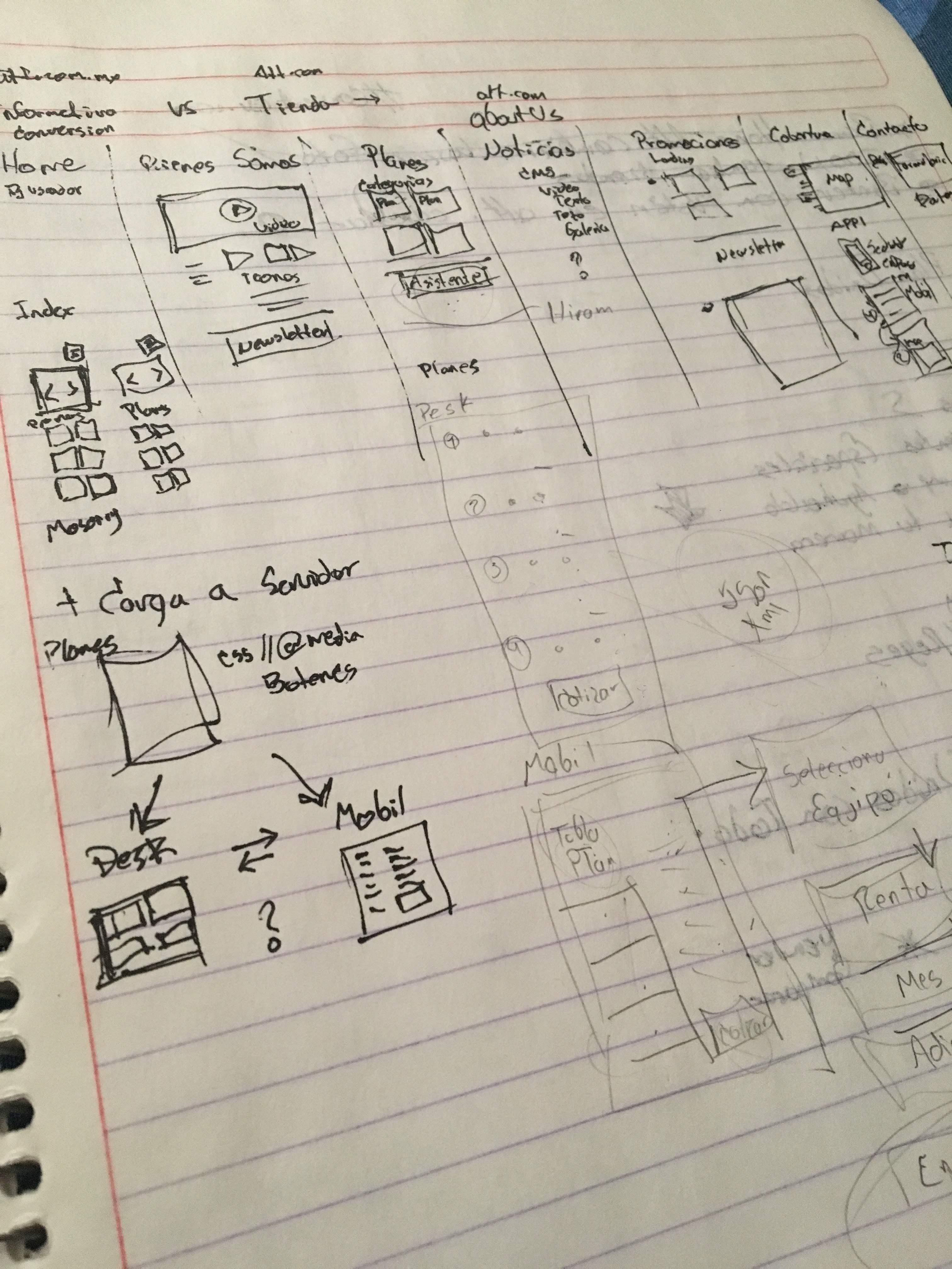
The content strategy was the first major UX hurdle since we needed to fully map out the digital experience in order to determine what content would need to be shut down of every brand and we needed to bring to life a site by our in-house AT&T teams.
Our Second major problem was the work of convincing stakeholders and even take work-lunch hours with every head of a department involucrated with the company to make them think on the final user, even now we still working on a heavy restructuration that will update the site for the end of 2019
UX Solutions

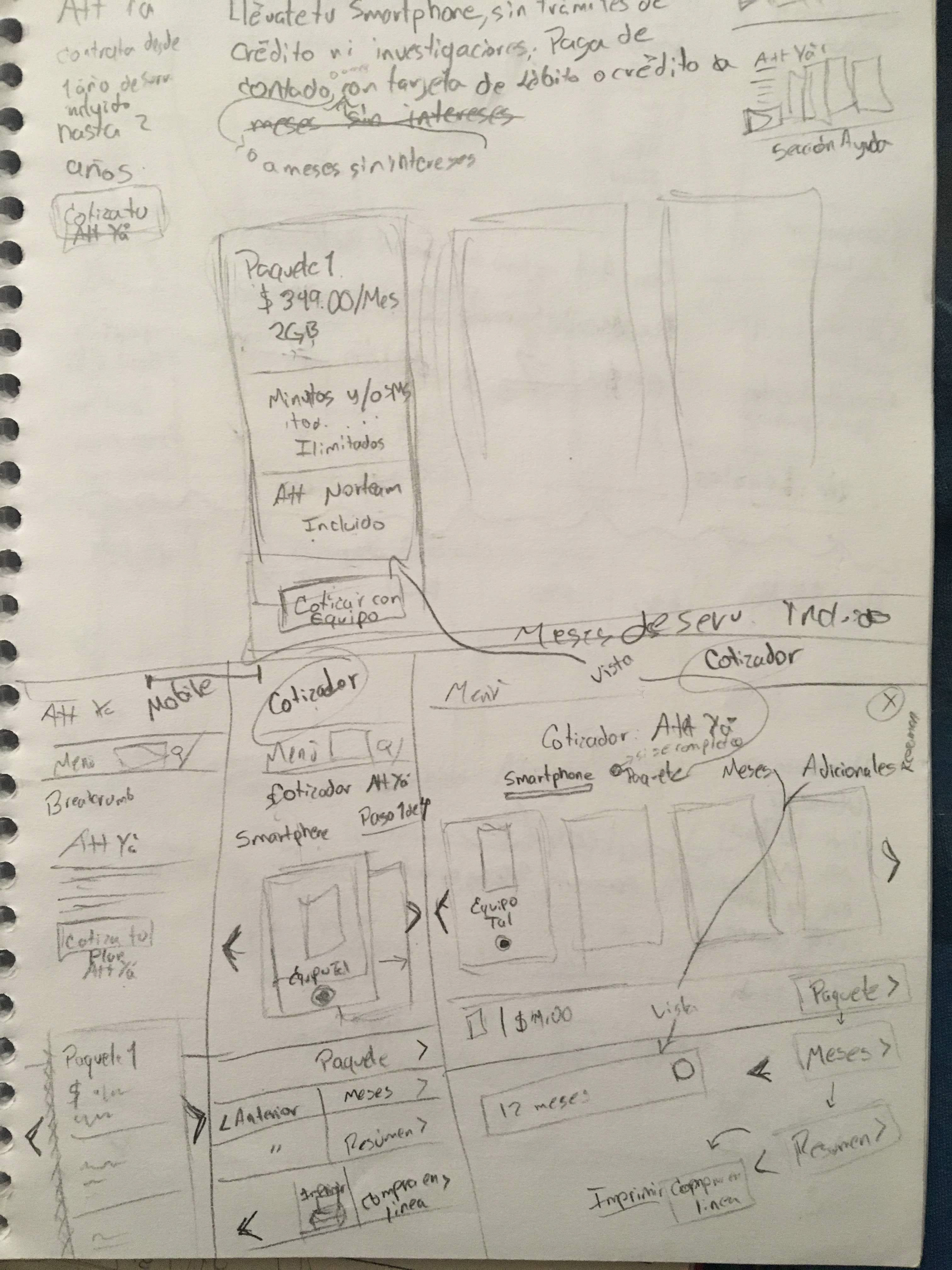
After identifying which perks would be featured, we were tasked with creating experiences that highlighted the AT&T brand and the range of diversity of Postpaid & Prepaid Plans for our clients.
Striking this balance required multiple rounds of prototyping and revisions. We needed to come up with a consistent way to organize all the content accompanying each perk, as the site used a combination of different mediums. To ensure a consistent experience for all users, every piece of content needed to be fully accessible on desktop and mobile, we discovered the need of help the users to get easy the selection of a Service Plan and make easy to found the customer service point of contact.
Case of Study and redesign for stakeholders
2017 to 2018
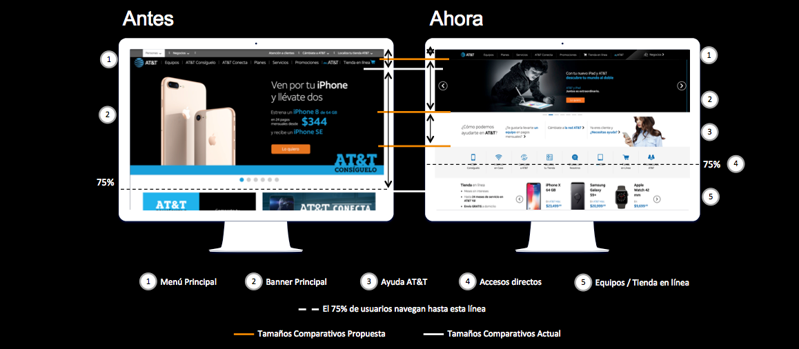
75% of our users use to navigate until the dotted line, and the banners were just seen as publicity more than an image with CTA so the traffic expected by the Data department wasn't fulfilled, we changed the size to make A/B testings, and added quick access icons.
UX Solutions
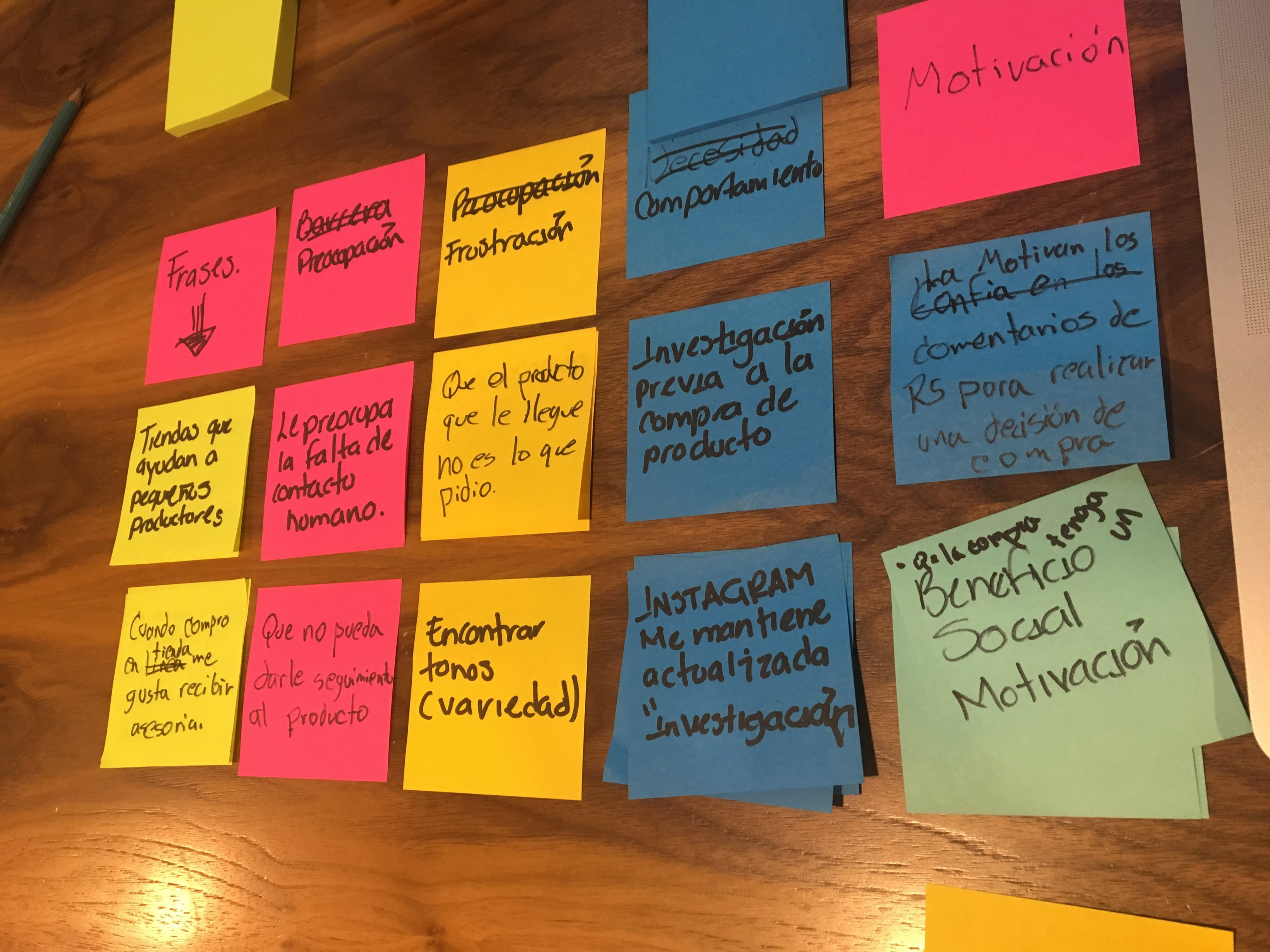
To solve our UX challenges, I created a design system based on two major case of studies that give us the highlights, were the user would stop and have the chance to engage with content before continuing through the experience, and hot spots, which included the scroll down, pointer movement and UI atomic design strategy with bite-sized content within each page.
To help the user move between the content, users can always see an exit from of the content they are in, whether it be the map button to skip ahead to another section, the next button within a highlight or an X/back when a user is in a hotspot overlay. We made sure to create and document the use of multiple components for multiscreen porpuses, and reuse it in the future to enhance the UI design process and the frontend development when they are viewing this experience on desktop, mobile or Google Cardboard VR.
We detected


For this project, it was especially important that the content is as accessible as possible, which is why we worked from a mobile-first design perspective to guarantee an equally good experience on both mobile and desktop.


Implementation of the Design System for 2019:
So far we have been working in the implementation of another technology. So far we decided to start building the experience one step at the time. This example belongs to the Entertainment sitepage and uses the components we designed the last year.
You can visit the site here: Entretenimiento
This ongoing process also involves:
* Information Arquitecture you can see it on the Menu & footer
* The UI with a Design System for the AT&T Web & Digital Team