
Brief:
In this scenario, Porsche has asked us to help them boost orders for their new electric luxury sedan, the “Taycan”.
Porsche needs help introducing their latest and greatest to a wider audience by making the best digital experience possible while keeping an eye on conversion by making reservations and ordering convenient and unhindered.
Design the Taycan landing page, addressing mobile and desktop use-cases.
Role: Designer
Process:
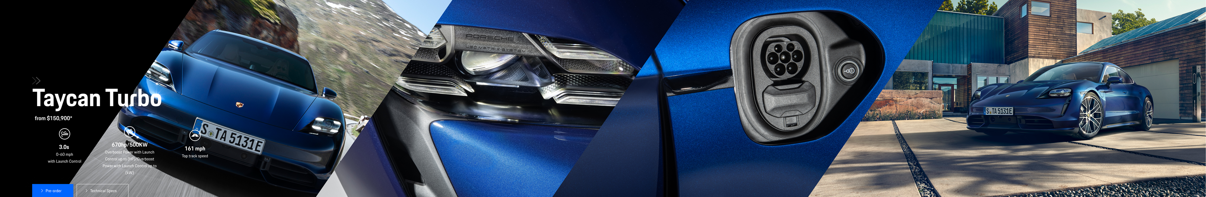
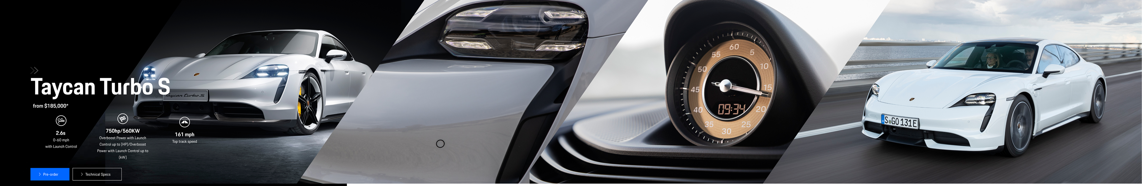
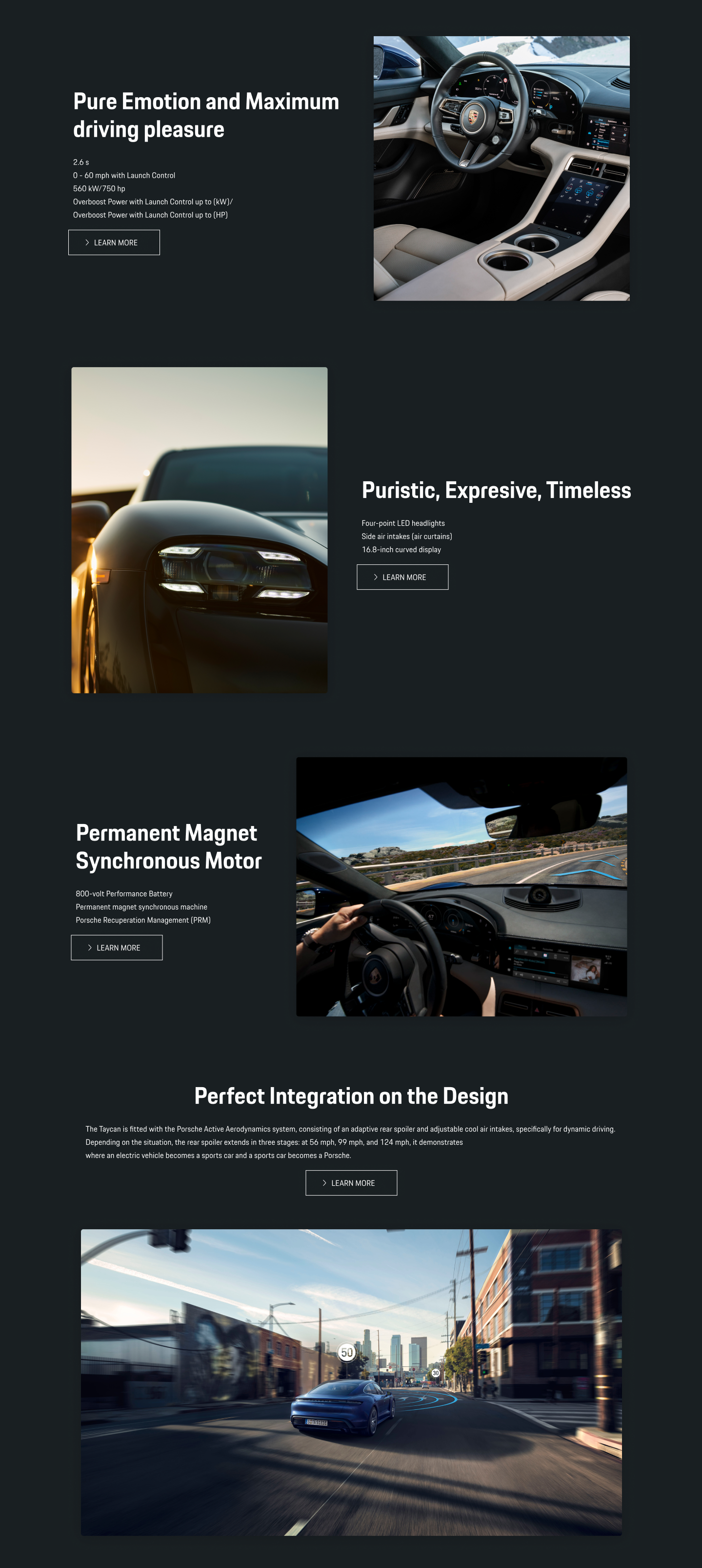
Porsche is a performance luxury brand. the idea was to capture and extend the sensory experiences Taycan enables and evokes. The design may target recognition and “having the best” but also fulfill the needs of consumers who are looking for top-line specs, offering hooks into deeper sections of the experience.
Competition in the electric auto space is growing (Tesla, Rivian, E-Tron, Polestar) I focus on detailing why Taycan is the best.
Competition in the electric auto space is growing (Tesla, Rivian, E-Tron, Polestar) I focus on detailing why Taycan is the best.
See the Mobile Demo here, it has a welcome animation:
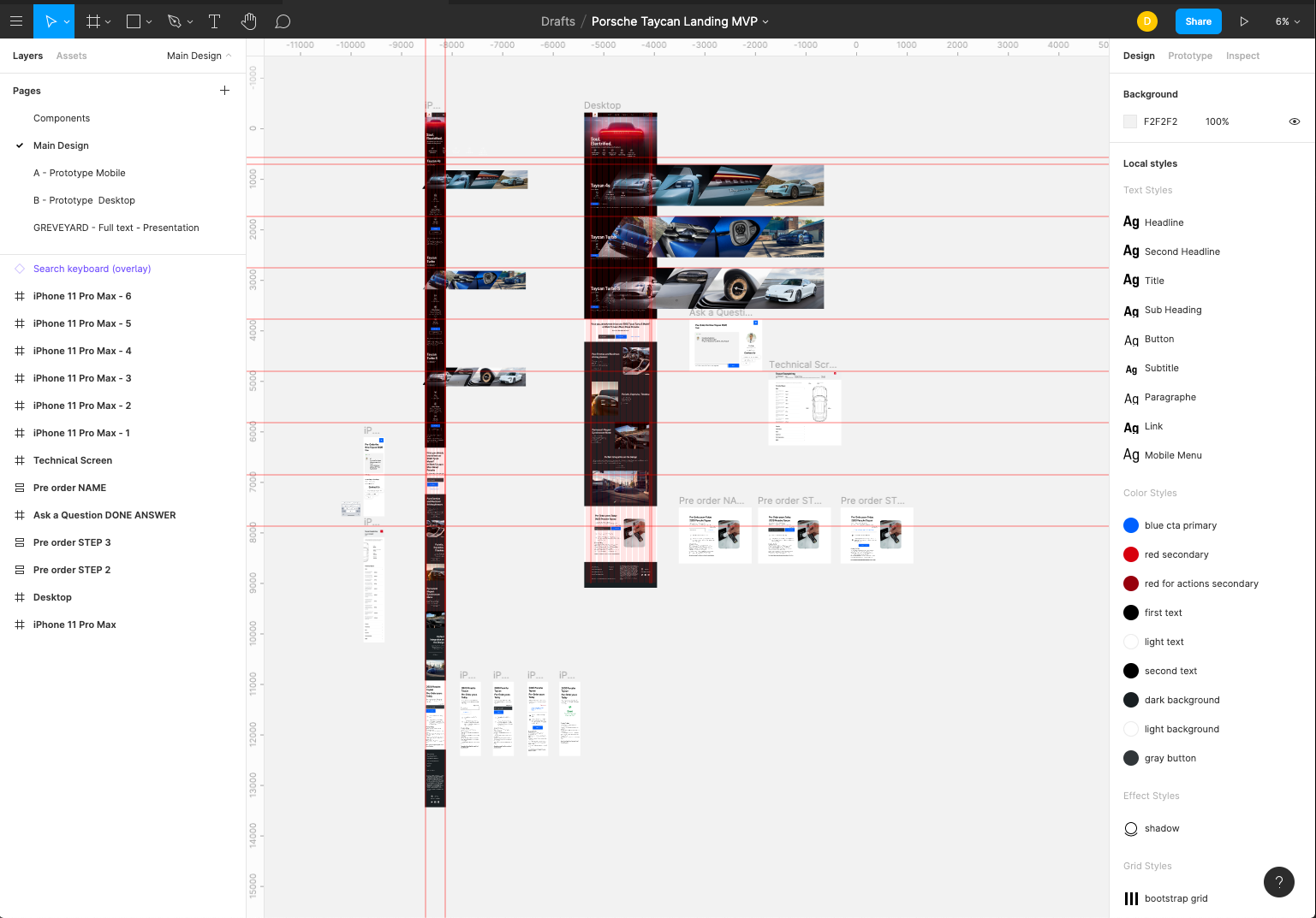
Figma Link: Taycan Mobile Landing Page Experience
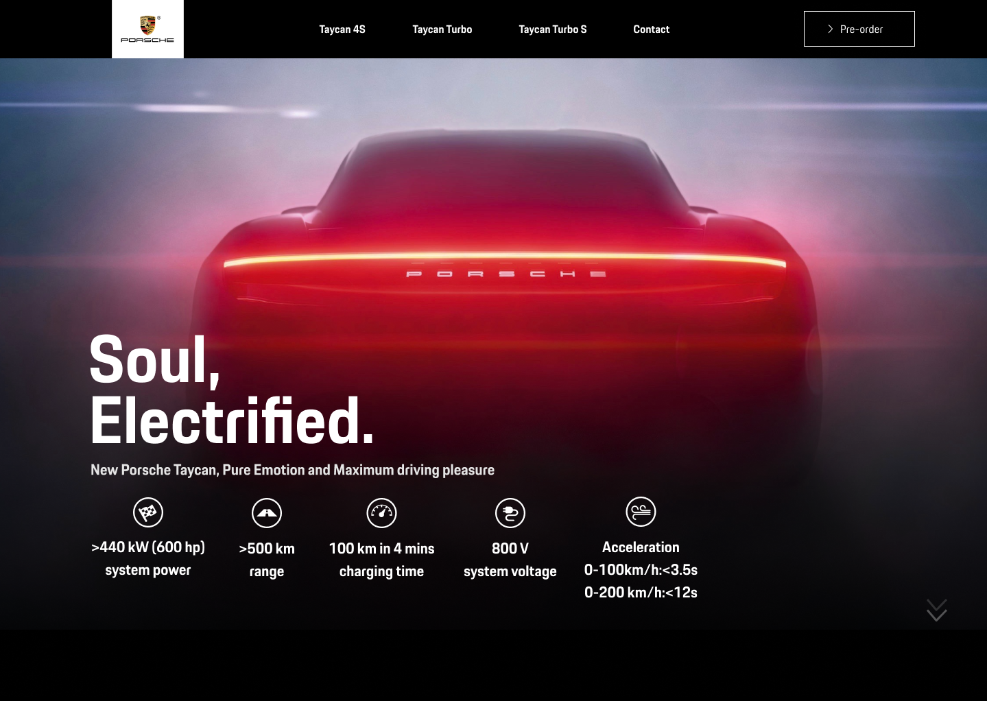
Here we are! The sports model "Taycan" from Porsche fully lives up to the brand's high-performance reputation.
My first approach was understanding the product I had in my hands. The new "Taycan," "A Guinness record car," "Spirited young horse," "a fast car to be electric," " Incredible acceleration, precise handling, and aggressive styling" " Porsche's first electric car is a sleek sport." It was clear, to do the landing, I should focus on emotion and feelings.
We will see some quick notes on the process on the following paragraphs...
Mood board:
By reading the news and the headings on the internet, I reinforced that the product should be in a visceral and behavioral level of rapid conversion that allows the brand to establish quick contact with customers. Every call-to-action of the page should use emotional triggers and close quickly through a conversion trigger.
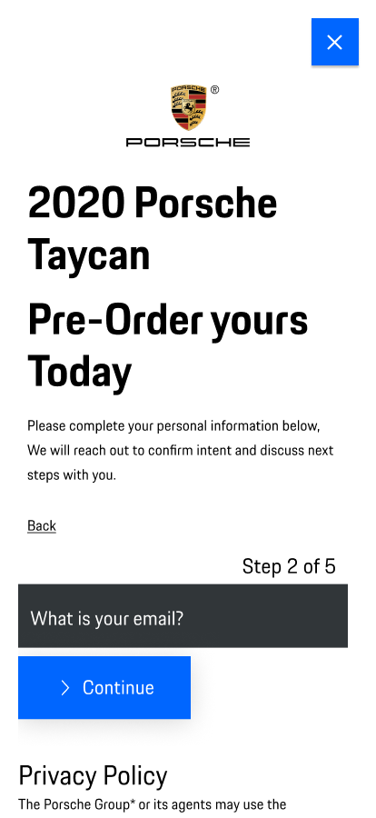
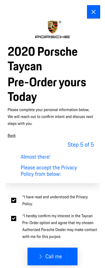
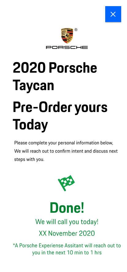
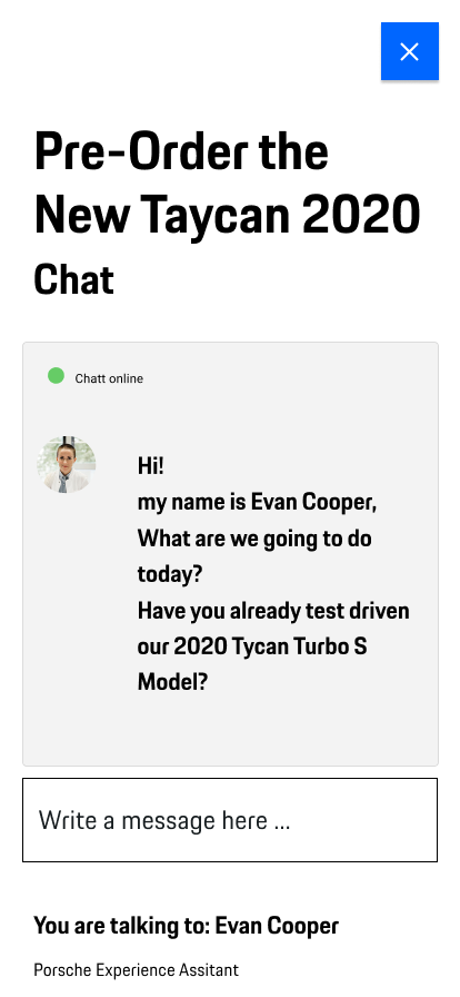
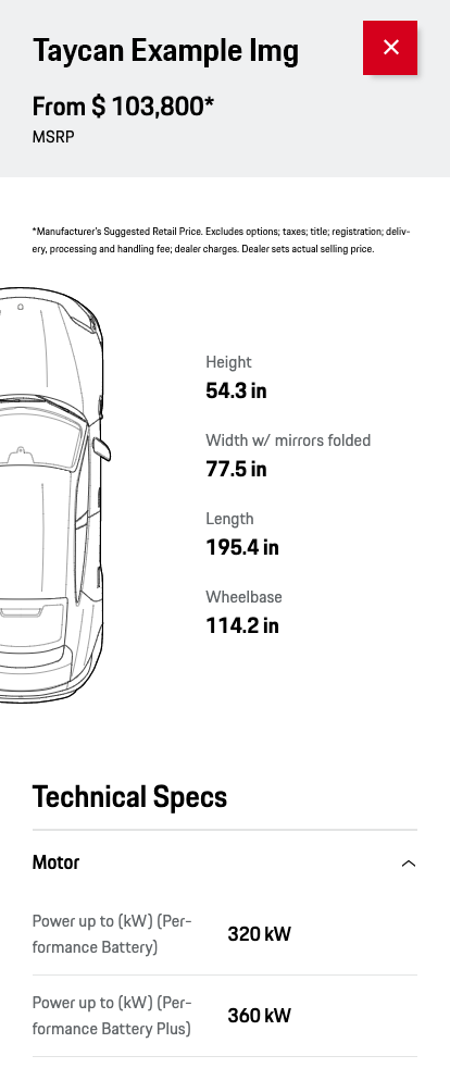
I assumed that the conversion task should happen using the online chat for personalized and direct treatment. The research shows me that this online chat system already exists in several countries. It applies for sales or to schedule appointments with dialers. Another clear finding was the contact form, which needed a painless, more straightforward experience, I thought, in a multistep way. Finally, I should place good-quality images with a detailed zoom over the 3 Taycan models to attract users' gaze.
Multistep Pre-order:

Color makes ice cream taste sweeter, veggies taste fresher, and coffee tastes richer. Now I should articulate the look and create the action, creating the wireframing. It was clear that it should be a universal design for a person who loves the brand, regardless of gender. A Landing represents clear affordances of speed and dynamism and stimulates the eye with the three models' photo details.
A part of the decision to create a one-page page was to think if the person browsing this site is coming from a segmented digital marketing strategy. If that could be the case, the starting point for the user could be an invitation, an email, a social network campaign, an SMS, a QR code, so the landing should focus on a "Porsche Tyda only" theme and offer one action at a time for the conversion, even during the scrolling, one call-to-action by scroll, if possible.

The perception should be dynamic; I would need to create cues and pathways to guide users' actions.
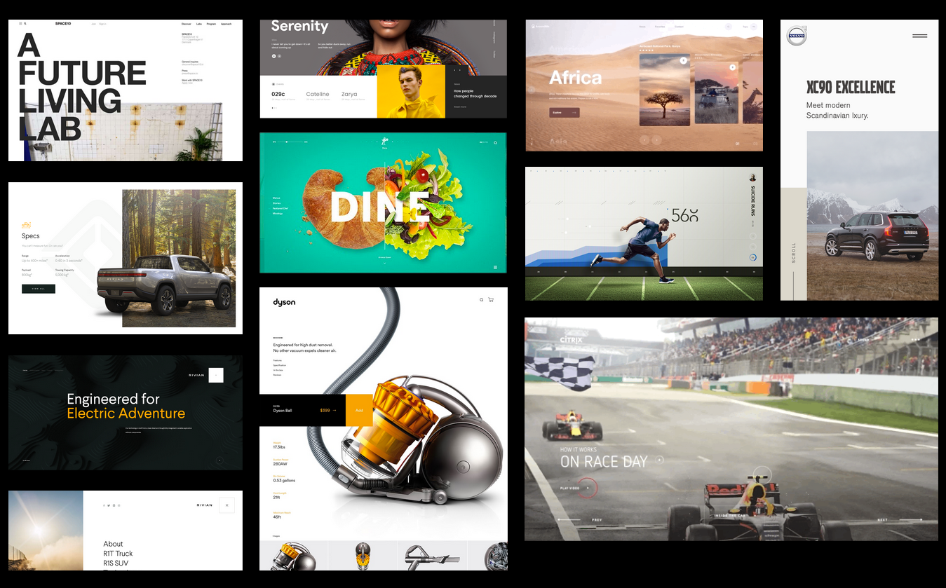
So I dive in through the official Porsche page, copying some affordances, like the buttons and the range of tones. I realized that I needed the brand guidelines manual, brand colors, SVG logos, fonts to install, and texts. I searched it online to download, and after analyzing the website styles, I copied the brand's graphic style to Figma. I found the press kit with high-fidelity images and other Porsche patterns on the official Porsche Press web page.
In the end, our picture of the world at any instant is shaped by what we want to do. I decided on Figma as the prototyping tool because it allowed me to design faster, explaining better with real motion interaction, and more comfortable tools to share with you.
Aftermath:
Placing videos in each carousel could be a good way to give an eye-catching CTA approach. Another note about the design decision is that I do not want to risk much animation effect that could make slower the website's loading; that's why I focus the effort on rapid prototyping and fast site loading, I think I need to validate that with a frontend-backend developer.
The purchase decision is always to take advantage of the timing. We have chat communication that depends on interaction. There is where we should place the backend effort. And also, I still believe I needed to work more on the design of that Chat Window.
This landing focuses only on the "Taycan" models, so it would have no problem to be mounted whit its own host or within the same server of the company. The technology to create it could quickly happen with any framework, AMP, or bootstrap; only the treatment of images and video would require special attention.
In case that this landing goes alive, there are SEO notes to take advantage of. For example, every button and every CTA must be measure by analytical tools, such as google analytics, and every trending keyword must be fixed. We can even play with, including heat maps. And of course, I already treated the color contrast for accessibility, but I'm sure that the code should need another revision.
Tanto la denominación “Porsche" como sus logotipos y/o sus isotipos, son marcas registradas propiedad de Porsche.